18 Types of Diagrams in PowerPoint: Which is the Right Chart Type for Your Presentation?
Presenting data is one of the most common content types in presentations. Speakers are often faced with the task of presenting their data in a way that directs the audience’s attention to the key messages.
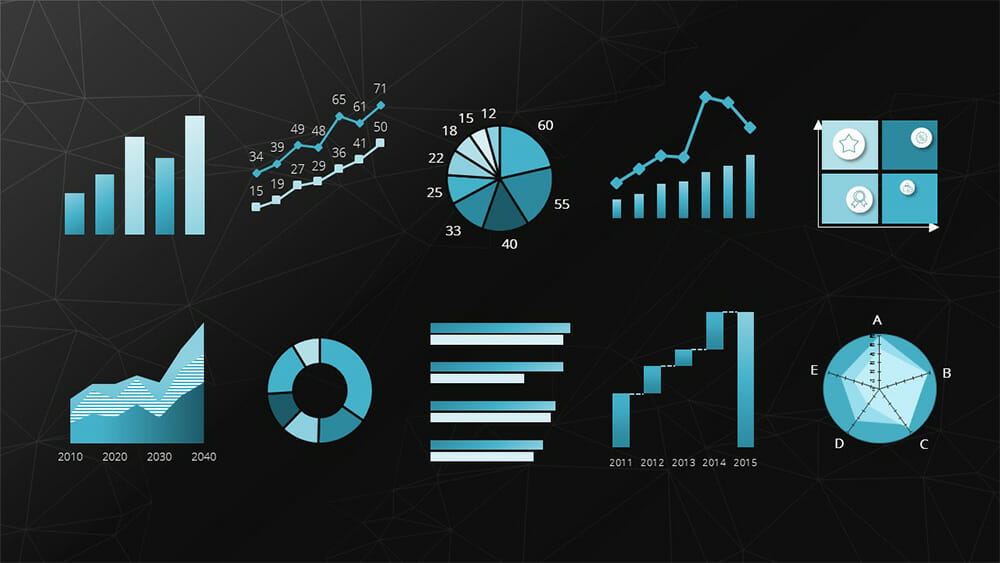
Today, we will show you 18 chart types with examples of their usage. This way, you can find the right diagram for your presentation purposes.
Storytelling & Data Visualization
Speakers should focus on telling a story with data. Storytelling is one of the most effective means of connecting with the audience and capturing their attention. Why? Because stories generate emotions and allow you to better reach your audience.
Presenting raw data without proper preparation will inevitably lead to losing the audience’s interest. The audience will unconsciously begin to orient themselves in the presented data series and interpret it, which consumes a significant portion of their concentration.
The challenge is to integrate complex and dry numbers into the narrative in a way that the audience can follow the argumentation. The key to success lies in communicating through targeted data visualizations.
The most well-known and popular form of data visualization is the diagram. The use of diagrams in PowerPoint presentations is practical due to the convenient integration of PowerPoint with Excel functions.
However, it is important to always consider the message that the presented data is intended to convey and the type of data involved. Not every diagram is suitable for every dataset.
These are just a few examples of the questions you should ask yourself before choosing a diagram for your presentation.
The 18 most important types of diagrams in PowerPoint
We have summarized the most well-known chart types, along with their advantages, applications, and limitations.
Now, let’s explore these diagram types and find the one that best suits your data and goals, allowing you to create a clear and compelling presentation.
1. Column Chart

The bar chart is the most commonly used and simplest type of diagram. By representing data through the varying heights of the bars, you can visually illustrate data and its differences.
The strengths of the bar chart type lie in depicting fluctuations over a period of time or comparing different subjects of investigation.
For example: Revenues of different departments per year.
Feel free to use professionally designed slide templates for bar charts from PresentationLoad!


2. Bar Chart

The bar chart is nothing more than a rotated version of the column chart. Like the column chart, the bar chart represents data and their differences through the distribution of bar sizes.
The major advantage of this chart type is that the horizontal orientation of the bars allows for the use of longer labels, such as survey questions.
Example: This chart type is excellent for representing rankings.
For tips on designing an appealing bar chart, you can refer to the article “Bar Charts.”
Feel free to use professionally designed slide templates for bar charts from PresentationLoad!


3. Stacked Column Chart

The stacked chart (also known as a cumulative or stacked chart) is a chart type that can represent the individual components of a composite whole. This chart type is suitable when comparing the composition of something over different time periods or with a different composition.
Example: Composition of cost components over a period of time.
Feel free to use professionally designed slide templates for stacked charts from PresentationLoad!

4. Line Chart

The line chart is used for comparing and representing temporal trends. The overlapping lines can be directly compared, making it easy to visualize developments and trends.
Example: Stock prices.
Feel free to use professionally designed slide templates for line charts from PresentationLoad!

5. Area Chart

The area chart is a modified form of the line chart. In this chart, the area between two lines or between the line and the X-axis is filled with color.
This allows for highlighting the relative relationship between two quantities graphically. This type of representation is particularly useful for visualizing operational and strategic gaps.
Example: Gap analysis.
Feel free to use professionally designed slide templates for area charts from PresentationLoad!
6. Pie Chart

Pie and donut charts represent compositions of a whole as slices of a pie. The major strength of these charts is visualizing relative proportions.
Example: However, pie charts are not suitable for representing temporal sequences.
Feel free to use professionally designed slide templates for pie charts from PresentationLoad!


7. Combination Chart

Combination charts are a combination of two different chart types. They are excellent for presenting the relationship between two data series with different scales. The most common variant is the combination of bar and line charts.
Example: Revenue (in millions) and number of employees (up to 100).
Feel free to use professionally designed slide templates for combination charts from PresentationLoad!
8. Radar Chart

The spider chart, also known as a star or radar chart, is particularly useful for displaying the development or characteristics of predefined criteria. Each category has its own axis, with the zero point located at the center.
Example: Comparing two companies based on predefined criteria (including benchmarking).
Feel free to use professionally designed slide templates for spider charts from PresentationLoad!

9. Portfolio Diagram

The bubble chart, also known as a portfolio chart, stands out with its three dimensions. The X and Y axes represent the measurement of a variable defined for each axis. This creates an accurate position of the bubble within the coordinate system. Additionally, the size of the bubble represents a third dimension.
Example: BCG matrix (depicting market growth, relative market share, and revenue).
Feel free to use professionally designed slide templates for bubble charts from PresentationLoad!
10. Waterfall Chart

The waterfall chart is a special form of the bar chart. It shows an initial value that is increased or decreased by additional values. Finally, the end value is depicted.
Example: Breaking down total costs into individual costs.
Feel free to use professionally designed slide templates for waterfall charts from PresentationLoad!

11. Bubble Chart

A bubble chart is used in data visualization to represent relationships between three or more variables. The purpose of a bubble chart is to visualize complex datasets in a simple and easily understandable way.
In a bubble chart, data points are represented as circles (bubbles), where the position of the bubbles on the X and Y axes represents the two main variables. The size of the bubbles represents a third variable, and in some cases, the color of the bubbles can be used to represent a fourth variable.
Companies use bubble charts to illustrate relationships between various financial data, such as in strategic management when visualizing BCG matrices.
Example: Creating a market share overview where revenue and product quantity are represented on the X and Y axes, and the respective market share is indicated by the different sizes of the bubbles.
Feel free to use professionally designed slide templates for bubble charts from PresentationLoad!

12. Scatter Diagram

A scatter plot is used to represent the relationship between two continuous variables. The purpose of a scatter plot is to visualize the correlation or pattern between these variables in a simple and easily understandable way. If there are dependencies between the two variables, patterns or structures such as linear or quadratic relationships can be observed, revealing average values, trends/developments, or concentrations.
In a scatter plot, data points are represented as dots or symbols, where the position of the points on the X and Y axes represents the two variables. The points are plotted independently, and their distribution in the chart shows the relationship between the variables.
Example: Examining the relationship between age and income.
Feel free to use professionally designed slide templates for scatter plots from PresentationLoad!

13. Sales Funnel

A funnel chart is used to represent the different stages of a process or sales pipeline. The shape of the funnel is crucial in the visualization. The first stage of the process is represented by the wider end, and the narrower end represents the final stage. The size of the sections within the funnel represents the number of items or data points in each stage of the process. The decreasing width of the funnel represents the decreasing magnitude of items transitioning from one stage to the next.
The purpose of a funnel chart is to visualize the number of items or data points going through the different stages of a process in a simple and easily understandable way. Funnel charts are often used to identify and analyze bottlenecks or weaknesses in a process.
Example: Analyzing a sales pipeline.
Feel free to use professionally designed slide templates for funnel charts from PresentationLoad!

14. Pyramid Chart

Pyramid charts are primarily used to represent demographic information in an easily understandable way. The chart depicts a vertically oriented, two-dimensional histogram.
Example: Visualizing the age structure and gender distribution of a population.
Feel free to use professionally designed slide templates for pyramid charts from PresentationLoad!

15. Gantt Chart
A Gantt chart is used to visually represent the activities of a project in a time-oriented table format. The structure of the chart allows for listing all project-related activities and their duration. This is displayed in the form of a bar that indicates both the start and end points of a time-based activity.
The chart provides an overview of how much time is required for each activity and when it will be completed, allowing project managers to have better control over the project timeline. It enables them to identify areas where the project is successful or not, thereby optimizing process flows through appropriate interventions.
Example: Presentation and management of a construction project.
Feel free to use professionally designed slide templates for Gantt charts from PresentationLoad!

16. Venn Diagram
Venn diagrams, using two, three, or more circles, are a practical method for illustrating overlapping or interconnected relationships. They provide a visual representation of the relationships and dependencies within a complex set of elements.
Venn diagrams can be a valuable tool for capturing the entirety of complex situations and understanding the relationships between elements. For more information, feel free to check out our blog post on “Venn Diagrams“.
Example: Analyzing the similarities and differences between different customer segments in a company.
Feel free to use professionally designed slide templates for Venn diagrams from PresentationLoad!

17. Process Diagram (for example Flowchart)
Process diagrams, such as flowcharts, are excellent for presenting processes and workflows in a clear and organized manner. They can represent both general concepts and specific relationships, making them a valuable tool for any company looking to showcase their business processes and workflows to stakeholders. Algorithms, workflows, and processes can be translated into flowcharts, facilitating analysis, documentation, and management of programs and workspaces.
Flowcharts are widely used and established in sectors such as business, finance, IT, and data processing, thanks to their effective visual representation.
Example: Illustrating and analyzing a customer service process in a company.
For more information, feel free to check out our blog post on “Flowcharts“.
Feel free to use professionally designed slide templates for flowcharts from PresentationLoad!

18. Organizational Chart
An organizational chart is a chart typed used to structure and organize a company or project, allowing for the clear representation of hierarchies. There are various types of organizational charts to choose from, including the single-line system, multiple-line system, matrix organization, and staff line representation.
The typical single-line system emphasizes clear responsibilities and a streamlined structure, while the multiple-line system shortens information pathways and contributes to specialization within individual instances.
Example: Presenting a product range or service offering in a clear and organized manner.
For more information, feel free to check out our blog post on “Organizational Charts“.
Feel free to use professionally designed slide templates for organizational charts from PresentationLoad!

Conclusion: Finding the right chart types for your purposes
In conclusion, you can find the right type of diagram for your purposes by referring to our 18 chart types and determining which one best suits your needs. With the appropriate diagram, you can visualize content much more easily and quickly, making it understandable for your audience.
If you have any questions regarding the article, feel free to contact us via email at [email protected]. We are here to assist you!
If you’re looking for visually supportive and professionally designed slide templates, be sure to check out our shop. We have a wide range of slides available for download on various (business) topics. Visit our shop today! ► Go to Shop
You may also be interested in the following articles:
Share this post


-

Design Thinking: Problem Solving with a Difference
-
Why Corporate Mission Statements Are So Important
-
7 Tips & Learnings from the Apple Keynote


-
Design Thinking: Problem Solving with a Difference
-
Why Corporate Mission Statements Are So Important
-
7 Tips & Learnings from the Apple Keynote