
Hotkeys and Tips for Navigating Through Your PowerPoint Presentation – Part 3
Hotkeys and tips for navigation during your PowerPoint presentation – Part 3
These issues have already been addressed:
Part 1 – From the Start of the Presentation to the Helpful Tools
- Using shortcuts during the presentation
- Accessing Slide Show Help with the F1 key
- Hiding the dialog menu and context menu
- Switching programs during the presentation
- Working with hyperlinks
- Inserting action buttons
Part 2 – Setting up Your Own Navigation Toolbar and Screen Timeout
- Putting together your own navigation toolbars
- Practical use of the slide master in the navigation toolbar
- Displaying a screen timeout
Upcoming Posts:
Part 3 – Orientation – for the Speakers and the Audience
- Installing chapter slides for audience orientation
- “Keeping an eye” on your agenda
- Working with two screens
Part 4 – Presenter View and the Difference from PowerPoint 2013/16
- Using Presenter View of PPT 2013/16
- What is new or different in the newer versions
- More tips & tricks
10.) Installation of section slides for information for the audience
Chapter slides or transition slides come between two subject areas of your lecture to help keep everyone focused. A break between each section eases the flow from one topic to the next which is beneficial for the speaker as well as the audience. These slides can be used to highlight the key points of the last topic or as a point of reference while you are working on a flip chart.
These slides can also be applied:
- to give audiences a clearer perspective on the next topic (i.e. recapping or inserting the agenda, text or image elements for the next topic)
- as a divider filled with photos (like those that couldn’t fit within the content) or a combination of pictures and large, distinctive letters that indicate the following topic
- with animations that create suspense for the upcoming topic.
Here are some examples of how this might look like:
Often large photos cannot fit on the content slides. Instead, you can use a photo on each different chapter slide to present the next topic.

To increase interest, you can display individual letters of the next chapter in big font. Unusual presentations will catch the eyes and arouse interest.

In the example above, you can also animate the big letters and let them come in from the top a little later. Since the first letter of each word in each case will be missing at first, the viewers will be curious as to what is being shown and will wait for what comes next.

You can also create interesting effects when you want to recap. In the next example, the agenda is surrounding the title of the next topic. You can let your imagination run wild with the design.

It is also possible to restate the entire agenda with the next topic item in a bold, contrasting color. Sometimes it even makes sense to put the non-relevant items more into the background, as this only serves as information.

To establish a clearer distinction between the next title and the agenda, you can show a reduced plan in a corner and just highlight the item. The viewer can then see where he is in the lecture.
TIP: When going from topic to topic, it isn’t uncommon for viewers to ask questions about any previous ones. You should have the complete agenda placed somewhere on your slide. It’s even better to provide a hyperlink for each point, which you can click to answer any questions right on the spot.

If you are very familiar with PowerPoint, you can effectively build animations that run to match the next item on the section slide. In this case, here are two gears winding together, that visualize the term “cooperation”, and then you can use that as an introduction to your topic.

11.) “Keeping an eye” on your agenda
If you have too many slides in one section, the audience might lose track of where they are (“Which subject are we on right now?”). This is why having the agenda on every slide is necessary.
However, you should always make sure you have enough space on the slide for your agenda so that the viewer can read it. A lengthy list will have to be considerably reduced. However, if you only have a few items on the agenda, or use a section of it, then you can display a concise version on the slides.
For that reason, minimize your agenda (boxes) as small as possible from the start. Here are some possibilities:
A.) Below, you can see the four items of the agenda in original size.
B.) To the right, the text boxes on the side (from the right) are somewhat reduced. In point three, you can already see the first problem: the text has moved from two lines to three lines.
C.) If you shorten the content of your text within the box, the boxes themselves will shrink.
D.) Depending on the topic, you could use tags for each item and avoid spacing issues. Under certain circumstances, you can also make the text and font more readable.

What’s next?
- First, run the entire procedure through once you have finished your content slides. Otherwise, you might need to move the agenda or adjust it.
- After reducing the form and minimizing the text, copy all elements.
- Change it by going to View> Slide Master.
- Select the slide design for your presentation master, for example Master>Title Only Layout for the title slide (A).
- Insert your agenda from temporary storage as an image (B).
- Reduce the graphic and place it in its final location on the slide (C).
- Click Close Master View.
- You will now see your inserted agenda on all slides that are associated with this layout.
- Go through every slide and make sure the agenda does not collide with the content. You might need to move and change some things, or in the worst case, the design itself.


TIP: Depending on the size of the agenda, sometimes it is better to work with different representations on several masters.
Now the “welding work” begins by inserting a label indicating the subject of each slide and putting the agenda text in it.
In the first example, a colored frame is used to show the current topic.

Depending on the size, text and colored display, it is useful in some cases, to let the frame appear with an animation before proceeding verbally with the actual content of the slide. This makes the viewer more attentive for the next topic. Depending on the shape and size, you can use the animation, Wheel> 1 Spoke. However, Wipe is useful for tracking, so viewers can be visually reminded of where you are.
There are more possibilities for highlighting the agenda, but you should consider the following questions:
- How much space is available for the entire agenda on the slide?
- Is it still readable?
- Does a different display make more sense?
Are the highlighting colors too strong or too weak?
In the next example, you will see a couple of different ways of highlighting:
A.) Instead of a frame, a transparent surface has been used. Make sure that the color is transparent enough or else you can no longer read the text.
B.) A simple underline may be sufficient.
C.) Or you can circle the item number.
D.) A single arrow can also indicate the agenda point. However, because this arrow should be placed on the left or right of the agenda, we are back to the question of spacing.

Here are a few other examples of the highlighting variety:
A.) Only the first agenda point can be clearly seen here. All remaining items are faded.
B.) Only one point is shown. But keep it in the correct position, so that the audience knows where you are.
C.) This is like example B), but the text is highlighted in color to draw more attention.
D.) In this example, only one agenda item is shown, but you can see all the remaining numbers.

If you have designed your agenda slide with photos or other graphic elements, you most likely need to change the graphic so that it remains visible when reduced.
A) On the left, you see two agenda examples in (almost) actual size. In the example above, pictures have been included with the numbers, while in the example below a large image has been placed in the background.
B) To the right, you see each version scaled-down, in which the readability has lessened. Depending on how much space is available on the content slides for the small agenda, you should correct the display and make sure it is clear.

Another possibility is to show the relevant agenda item on the (lower) edge of the slide. Again, you will need to test the spacing requirements for all slides.

the slide. Again, you will need to test the spacing requirements for all slides.
Of course, it is also possible to display only a few parts of the agenda in this way. This approach works if you have a lot of items or want to show the subcategories. In any case, you should consider going back to highlighting the current agenda point.

Sometimes you don’t have any place on the slide to insert the agenda. Try using an animation. After each slide changes the first thing the spectators will see is your agenda, or parts of it, as an overview (with an animation path) coming from below. Depending on the text size and length, let these disappear after a certain time.
TIP: This trick can also be applied to all other agenda displays described here. This version has an additional advantage: the points are not included in a printout, which can be rather annoying. They are only used during the presentation as a guide.
Every presenter designs his talk differently, so you can also consider this option: In the previous blog post, you learned how to put an “invisible” rectangle on the slide or the slide master itself. Activate this rectangle with a trigger function, so that if you click this box, the agenda will appear from the side. Then, you can display the reduced version when necessary. For example,
- if they are on a chapter slide and explicitly indicate the agenda or
- you need the agenda at any given time certain time on short notice, or
- the viewers specifically request this overview.
This requires a bit of flair because the audience doesn’t always need to see the agenda, so use this only when really necessary.
TIP: If the agenda has a very comprehensive overview also containing numerous sub-items, you should consider making a small presentation with only these elements and jumping there when needed using the invisible rectangle.
12.) Working with two screens
During your presentation, you might refer to something on which you aren’t 100% certain and need to look at your notes or other files. Presenter view helps. You can use Presenter view as a tool for navigation. In principle, it is important that you as the speaker can view features on the laptop while the audience continues to follow the projection. You can use other applications during the presentation without viewers even noticing it.
On the ribbon, go to Slide Show and check the small box for Use Presenter View on the right. However, if you haven’t connected a second monitor yet, an error message will appear.
If you have connected a second screen/ projector to the laptop, you need to change the settings (under certain circumstances) by pressing

and switching from Duplicate (normal projector presentation) to Extend.

Normally, the Windows Display menu pops up like the image below. However, versions may vary.

If you have the advanced setting for two screens enabled, you will see it in the display.
A.) Next to Detect (top right), you will see that two screens are displayed at this point.
B.) Here you can now see a choice of two display devices. Select one to be your main screen.
C.) Then check this box. Then, if you haven’t already, go back into PowerPoint and check Use Presenter View and start your presentation.

CAUTION:
- At the end of the presentation, your normal desktop image will be projected!
- After completion of your presentation, you should remember that you will need to reset the settings for this type of presentation again, as this does not happen automatically.
We hope you’ll enjoy exploring all your possibilities!
Share this post

-

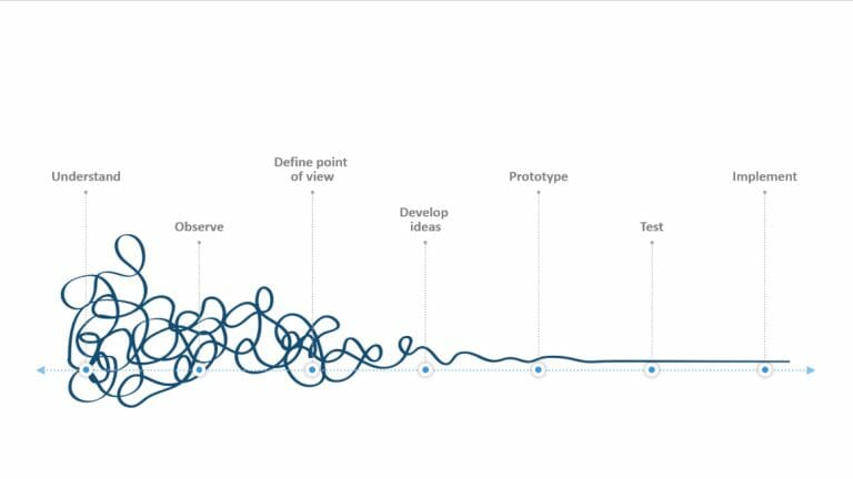
Design Thinking: Problem Solving with a Difference
-
Why Corporate Mission Statements Are So Important
-
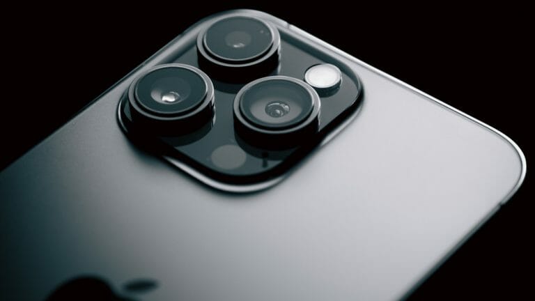
7 Tips & Learnings from the Apple Keynote

-
Design Thinking: Problem Solving with a Difference
-
Why Corporate Mission Statements Are So Important
-
7 Tips & Learnings from the Apple Keynote