Make the Most out of Tables in Your Presentation
Tables are used everywhere in business. They are one of the most practical ways to present key data and figures. So it makes sense that they have become a design staple for PowerPoint presentations. Unfortunately, poor design and formatting have given tables a bad name. Here are some tips to create standout table graphics.
Here’s a question you need to ask yourself from the start: Does my presentation really need a table? Remember, you may not have the time to explain the content of your table during your presentation. If the table isn’t working for you, you can be sure it isn’t working for the audience.
The following tips will help you make the most out of tables in your presentation:
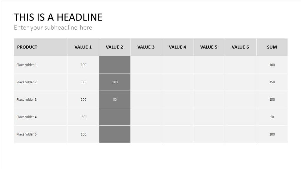
- Make sure the table isn’t too large. Ideally, the audience should be able to see key data at a glance. If the table is large and contains too much content, you risk losing your audience’s attention.
- Make text elements as legible as possible, focusing specifically on the font and font size. Choose a typeface that can be seen from the back of the room. Also make sure that spacing is sufficient and clear.
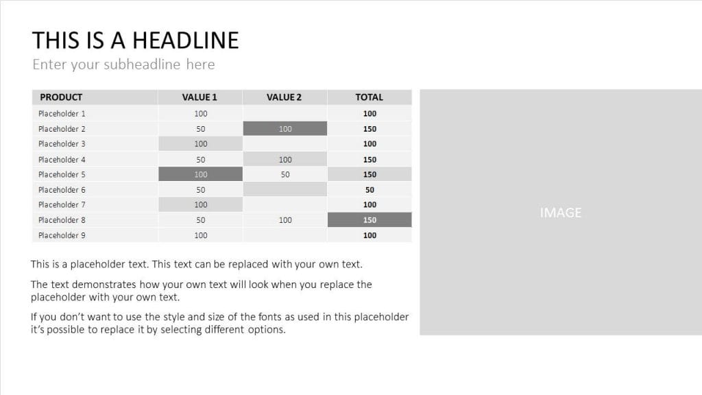
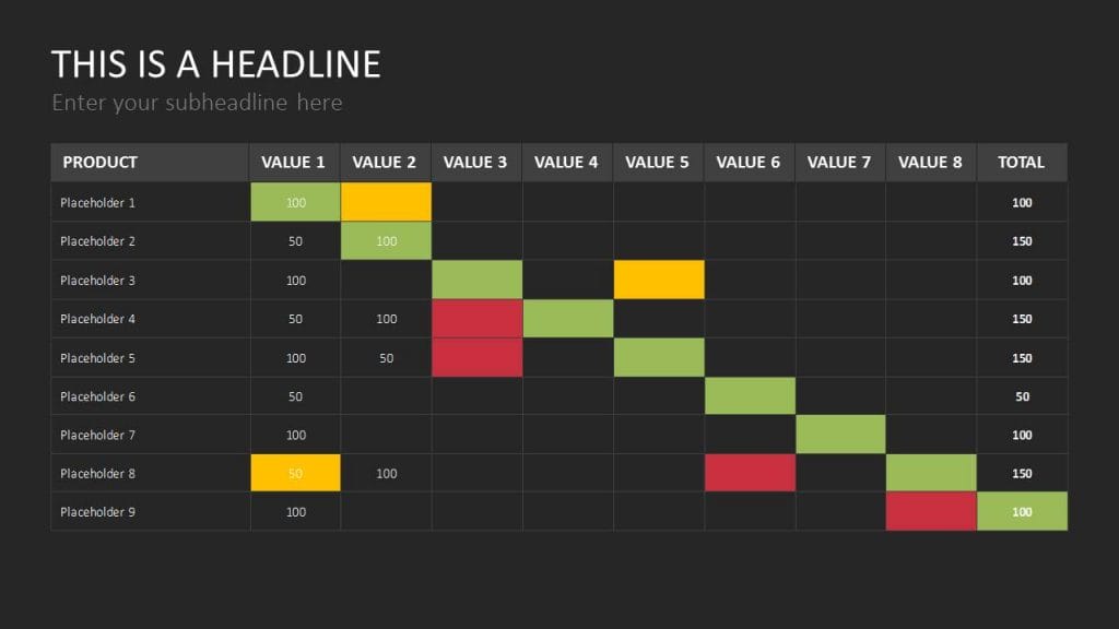
- Highlight important content. Use color to emphasize key figures, e.g., green for positive numbers and red for negative numbers. Or, use one color to highlight important data. But don’t go overboard. Using too many colors will overwhelm your table, making the content hard to read.
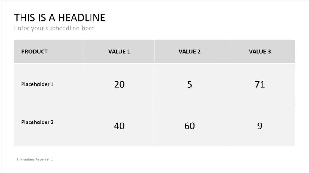
- Remove unnecessary content. Omit anything redundant and condense your content to the essentials. There are other ways of avoiding repeated content. For example, write “all data as percentages” in a footnote instead of adding a percentage sign to each number. Figures should always be rounded up or down to be as legible as possible.
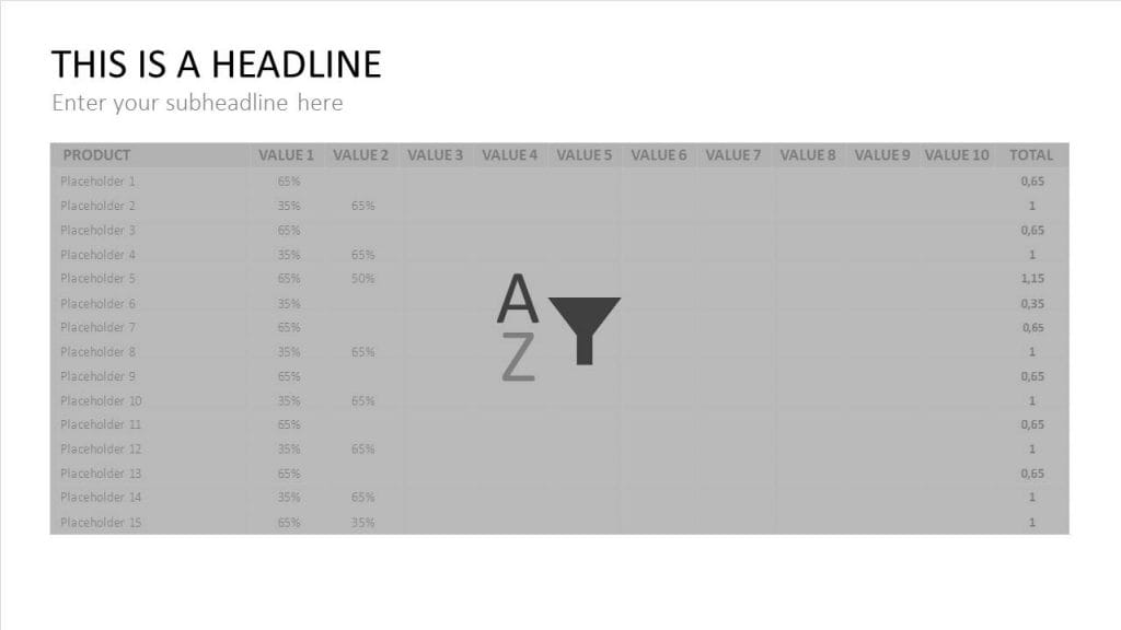
- Have a practical approach to sorting data. Designing tables always depends on the context of the presentation. Data is usually arranged alphabetically or chronologically. However, it may make more sense to sort your data according to key figure amounts. This is when Excel comes in handy. Choose the “Sort and Filter” function before inserting the table into PowerPoint.
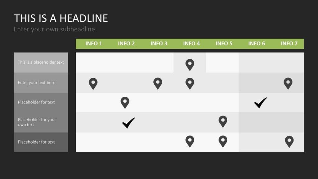
- Use icons or infographics to visually enhance your tables. Tables benefit greatly from appealing graphics. Icons, such as check marks or red crosses, can be used to indicate an accomplishment. Symbolic images for specific data groups – e.g., a car icon to display automobile sales figures – can help convey numbers in a more memorable way. Process bars can be displayed in the bottom corner to show milestones or the current progress of a project.
It’s worth taking the time to make your tables as coherent as possible. The audience will be able to follow along, won’t lose focus, and will need fewer clarifications. Careful preparation and clear content will ensure your presentation is a success.
