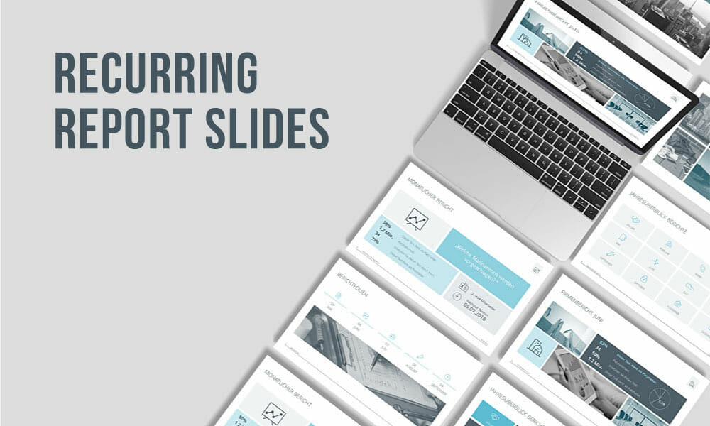
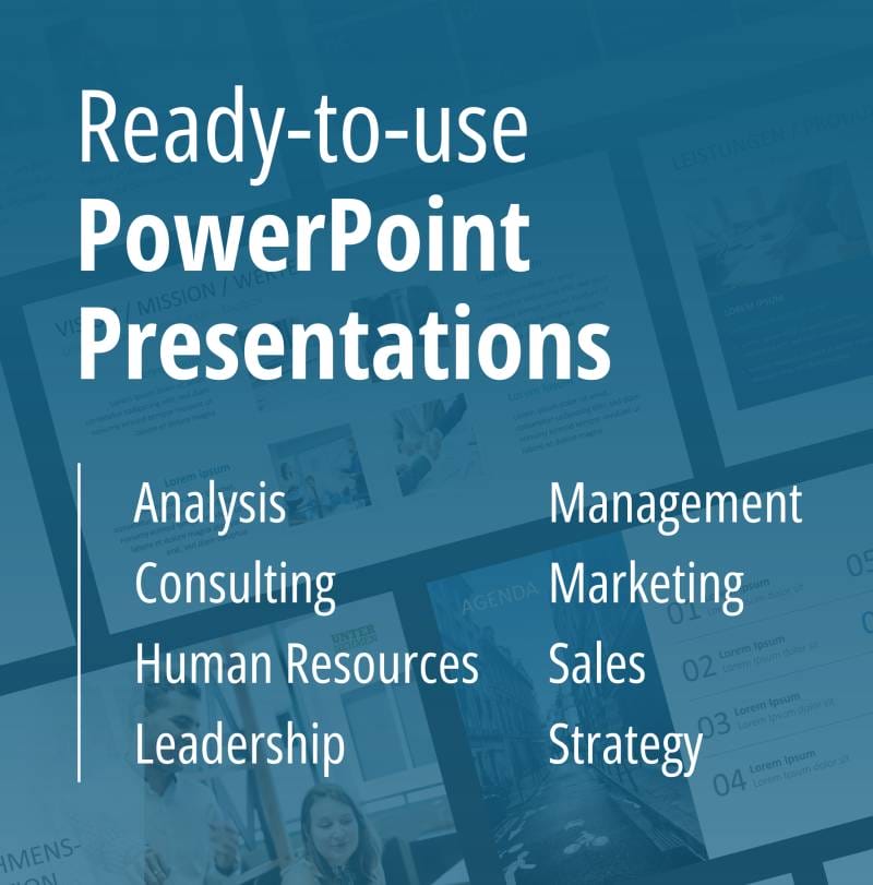
Optimize Recurring Report Slides: Save Time Creating Effective and Modern Status Overviews
Reading Time: 2 minutes
|
Author: Tom Becker
Reports that are repeated in a presentation can quickly become tedious. Presentations full of dry facts and figures that are presented the same way throughout will leave your audience bored and uninspired.
Here are a few ideas to save time and give your reports some wow factor:
- Design an eye-catching mock-up of slides that can be filled with different content whenever you need. This way you don’t have to worry about layout and formatting every time!
- Effective visuals arouse the interest of your audience. Images and graphics highlight important core statements and allow the viewer to clearly understand your key points.
- Compile your content in a visually appealing way by dividing information, text, and graphics into four rectangles. This streamlines your presentation and makes it easier for the audience to follow along.

Ready-made report slides hold several advantages for you and your audience:
- Important information is optimally presented.
- Images pique the audience’s attention. There are few other ways to capture the audience’s attention so efficiently.
- Using different colors enables you to direct the viewer’s eye to what you consider essential. It allows you to put specific content in the spotlight.
Try this for your next mock-up:
- At the top left, use a pictogram that illustrates the current topic. This is particularly useful when the same topic is discussed over several slides. Your audience will immediately recognize the pictogram, making it easier for them to keep track during your presentation.
Pictograms for numerous topics can be found, for example, under the Icon category in our shop:
- At the top right, formulate the topic of the slide as a question or key information.
- The bottom left provides space for additional information, such as facts, figures, comments or ratings.
- You can add important information such as deadlines, goals, tasks or areas of responsibility to the bottom right. If necessary, you can also use icons that quickly display the status of individual items.
You can also present your content in a tile structure:

- Draw four rectangles by using the shapes on the Insert and Shapes tab. Arrange them in the way you want. Above is an example.
- Choose different colors for your rectangles. To do this, click on a rectangle and select Shape Fill and Shape Outline from the menu.
- Finally, add text, pictograms, and/or icons.
Share this post

-

Design Thinking: Problem Solving with a Difference
-
Why Corporate Mission Statements Are So Important
-
7 Tips & Learnings from the Apple Keynote


-
Design Thinking: Problem Solving with a Difference
-
Why Corporate Mission Statements Are So Important
-
7 Tips & Learnings from the Apple Keynote