Using Maps in PowerPoint: The Best Ideas and Tips
Maps are perfect for displaying locations, sales territories, employee distribution and customers in sales and company presentations. In this article, we’ll take a look at the eight best ideas and tips for using maps in your presentations.
With professional map graphics, you can create a variety of charts, diagrams and infographics that are much more vivid and visual than pure text content. Editable maps in vector format allow you to color individual countries individually, adapt them to your corporate design and easily highlight or mark countries, regions or continents.
Idea #1: Visualize company locations on maps in PowerPoint
Use a map to show the locations, branches and cities where your company is active. A detailed map is the best way to present and highlight geographical locations.

Map graphics: Maps of Germany, Austria and Switzerland illustrating locations in the three DACH countries.
Symbols and shapes allow you to label your company headquarters, regional branches, production facilities and sales partners in a variety of ways. They also provide a visual overview of your organizational structure.

A map can clearly show how your various company locations are networked. Concentric circles and lines indicating distances can be used to visualize proximity to your customers – a key factor in choosing a service provider.
Idea #2: Display sales territories as a map
Detailed maps are great for displaying sales territories, either by region or by post code. You can find post code map templates for Germany, Austria and Switzerland on our download page.

Detailed PowerPoint postcode maps are ideal for planning and visualizing sales territories.
Because these post code maps are highly detailed, we suggest presenting individual regions or areas on seperate PowerPoint slides. You can also use the different animation effects in PowerPoint 365 to zoom in or transition from the whole map to individual areas.

Maps with two or three post code areas are perfect for dividing up and visualizing sales territories. Are you looking for a customized map of your sales territories? Feel free to get in touch with us. We would be happy to create a map tailored to your requirements!
Idea #3: Use a color legend to highlight data by region and country
Maps are also a great way to highlight countries or regions with a color legend. Different colors are used to distinguish values. For example, a color legend can show your international sales distribution or the number of customers per country.

Idea #4: Maps with pie charts
Combine your maps with pie charts to display percentages of segment data, and revenue or product sales distribution in a given area. Example: A sales team wants to visualize the actual sales figures of its products to better assess market potential and regional differences.

To do this, the products are divided into 3 different categories (blue, green, grey). The size of the individual circle segments represents the number or sales in the corresponding categories. The analyst creates a pie chart for each area and links it with the corresponding data (e.g., with Microsoft Excel). The charts provide a clear overview of any disparities between regions. The analyst can then investigate further to find out the specific reasons behind these differences.
Here’s how to create pie charts on your map in PowerPoint:
- Click on Insert > Chart and select Pie.
- Use the data sheet to insert your data.
- Repeat these steps, position and resize the pie charts to fit the regions you want to analyze.
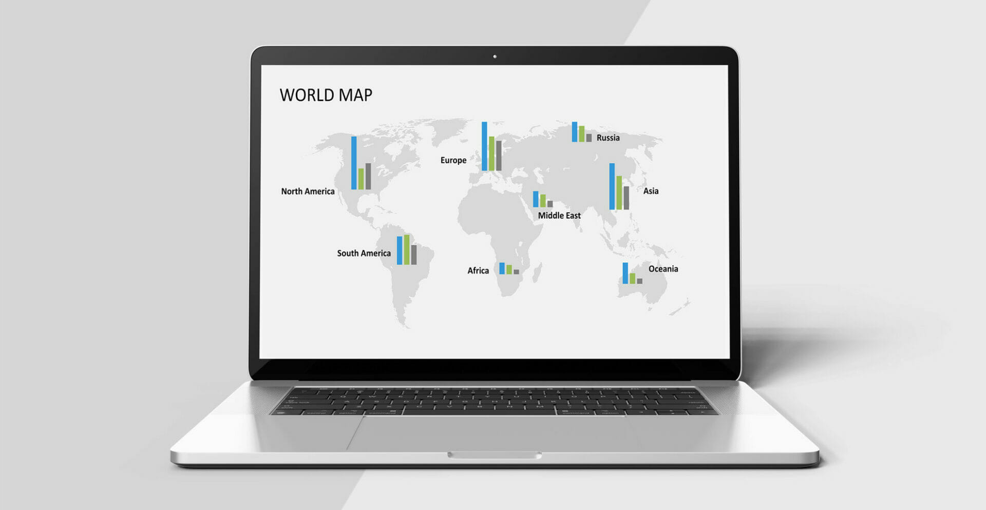
Idea #5: Maps with bar charts
A bar chart is another way you can visualize regional data on a map. You can either create bar charts directly in PowerPoint or insert linked charts and data from Excel.

Bar charts often provide a clearer picture of the geographical distribution of your data and their ranking. Here’s the same example as the pie chart above. You can see that the columns make it easier to interpret the differences between the values.

When performing a regional analysis, a 100% stacked bar chart is a great way to compare a percentage in which each value contributes to the total. This is another viable alternative to the classic pie chart.
Idea #6: Maps with graduated symbols (circles / bubbles)
Create a map with symbols of graduated sizes to clearly display different values. Large symbols represent larger values (number of customers, sales volume, revenue, etc.) and provide a quick view of which regions are most important for your business.

Here’s an example of a graduated symbol map – in this case, circles. The size of each circle represents a specific value. Although circles are probably the best choice for this kind of map, you can of course use other shapes and graphics. The important thing to remember is that the size differences must be clearly visible. You can also use colors to distinguish key (larger) values from others.

Idea #7: Country maps as relationship maps
A relationship map provides an overview of connections between one or more locations or regions. These relationships can be visualized in one direction or in both directions, such as with supply chains.

The connections can also be displayed with different colors or line thicknesses to show the dimension of the relationship, such data between the individual entities or the importance of the relationship. The point is to show which entities are related and how. Example: An industrial company wants to show the supply relationships with national and international manufacturers and illustrate which supply chains are critical to the success of the entire process. A logistics company wants to show different transport routes – by air, water and land.
Idea #8: Creative design options for PowerPoint maps
There are many creative design options available that steer away from traditional map graphics showing precise political borders and geographical features.

An interesting example is a world map created entirely of dots. Despite the abstract design, individual areas, such as continents and locations, can still be visualized without being too literal. This is definitely a trend for business presentations that want to provide a general geographical overview without being too detailed.


Editable maps in PowerPoint
The most important editing capability of our maps is the option to color individual countries and areas. This allows you to highlight their importance to your company’s activities. All maps are made up of individual shapes, so they can be edited directly in PowerPoint.
To edit a map in PowerPoint:
- Click on a country with your mouse or select a shape. If necessary, you may have to ungroup several countries first or click the shapes several times within the group to select the desired country.
- Now, select Shape Fill to choose a color. You can also use Shape Outline to customize the line color or thickness to match the shape.

One way to focus on a specific area or continent is to present an enlarged section of a region above the world map. This magnifying glass effect is particularly effective when you want to distinguish several locations within a metropolitan area on a specific continent. Our World Maps PowerPoint template already contains the most important regions and designs, which are ready for you to use in your presentations.
PowerPoint maps: download or create your own?
Although it’s possible to create maps in Microsoft PowerPoint and Excel, this function is usually only supported in the latest program versions (e.g., by connecting to Bing maps etc.).
A simpler and more user-friendly way is to use ready-made maps in PPT format, which you can easily edit without having to draw or create the maps yourself. All country maps, as well as editable maps of Germany (including Austria and Switzerland), maps of Europe and world maps for PowerPoint can be found here on our download page: https://www.presentationload.com/powerpoint-maps/

Insert maps into PowerPoint
You can include maps in different formats and from different sources in your presentations. But be aware of copyrights and rights of use. For example, Google Maps does not allow screenshots or maps to be integrated into other applications.
As with pictures, the copyright holder’s consent must be obtained in advance. This is different with maps offered for commercial download. In this case, you acquire the rights of use for a graphic file which can then be used freely for your business presentations. These maps consist of individual vector shapes, which can be divided into their individual components with the command Ungroup to highlight certain regions or countries in color.
Some maps are already integrated in newer PowerPoint versions so you can easily insert and adjust them. In our PresentationLoad download shop, you can find maps of all countries, including states, provinces and post code areas, maps of Europe and the world, and so much more.
Create world maps in PowerPoint
Is your company internationally positioned with locations and customers around the world? If so, simply use an editable world map in your next company presentation. You can customize the colors of countries or mark cities and locations with a colored dot on the map.
PresentationLoad’s PPT maps give you one big advantage: All maps are detailed and up-to-date and can be easily edited and colored by you. Here are a few examples of how you can best present your company locations on a world map in PowerPoint.
Why Choose PowerPoint maps from PresentationLoad?
Our maps have been specifically created for PPT presentations. You’re guaranteed professional results for your sales and company presentations. Since all maps are created directly in a PPT file, you can easily edit, color and adjust them to your corporate design. The maps can be used independently of other tools or software and are guaranteed to display correctly in all PowerPoint versions.
Maps allow you to visualize geographical information and are much more effective and appealing than tables or pure text. Because they are vector-based shapes, you can scale them to any size and print them in any resolution. Use our maps now to present your locations, regional analyses and sales territories including the distribution of your employees, customers and sales.
Create interactive maps with hyperlinks
Interactive PowerPoint maps are ideal if you want to display content relating to different countries or regions in a European or world map.
You can show a complete map overview on the first slide and then link the individual countries to other slides, which will only display the corresponding country and information. PowerPoint’s hyperlinks and action buttons makes this easy and work in any PPT version, as well as in PDF format.

This is how an interactive map in PowerPoint works:
- Make sure that your map consists of individual shapes and you can select the countries individually. If necessary, ungroup them so that each country can be clicked on directly.
- Now mark a country on the map and open the Insert Hyperlink dialog box (Ctrl + K)
- Select Place in This Document on the left and mark the slides you want to link to on the right.
- Confirm by clicking OK and your hyperlink is completely linked.
- Repeat each step for all other countries or regions on your map.

Insert Hyperlink & Link dialog box in PowerPoint.
Create button to return to the overview page
After inserting your interactive maps into PowerPoint, the only thing missing is a button that allows you to navigate back to the overview page. Simply add a graphic or shape that you want to use for this and set up a hyperlink using the Action function to jump back to the previous slide.
To set up an action button in PowerPoint:
- Select the graphic or shape you want to use as your button.
- Select Insert > Action from the toolbar.
- Select the action Hyperlink to and Last Slide Viewed.
- Confirm with OK.

Insert action button into PowerPoint.
PowerPoint creates a hyperlink that always jumps back to the slide you came from, no matter which slide it is. It is similar to the back button in an Internet browser.
Create interactive maps from a single composite graphic
If your map consists of only one image or graphic and you can’t edit the countries and regions as individual shapes, you may think it’s impossible to create hyperlinks to selected areas. But there is a trick you can use. Simply use the Freeform option under Shapes to plot the desired region after assigning a hyperlink to that shape.
Next, set the fill color and line color to transparent or increase the transparency of the fill color to 100%. This means that your shape will not be visible in screen view in PowerPoint, but the hyperlink will work if you move the mouse pointer over the corresponding area.

Ready-made maps for PowerPoint
Do you not have enough time to create your own maps and are looking for professional templates and maps? Visit our download shop for PowerPoint templates and download a map as a vector graphic. There are so many advantages: You can scale any map and country as you want without quality loss. In addition, individual countries can be highlighted and colored. Each template contains many additional design examples and layouts, which you can apply directly and adapt to your requirements.
All maps are available in an editable PowerPoint format and can be found here in our download shop:
https://www.presentationload.com/powerpoint-maps/
Share this post


-

Design Thinking: Problem Solving with a Difference
-
Why Corporate Mission Statements Are So Important
-
7 Tips & Learnings from the Apple Keynote


-
Design Thinking: Problem Solving with a Difference
-
Why Corporate Mission Statements Are So Important
-
7 Tips & Learnings from the Apple Keynote